Version 1.0.4 of Simple Fields is now live. It’s a small update that features two noticeable changes:
Less clutter & less space
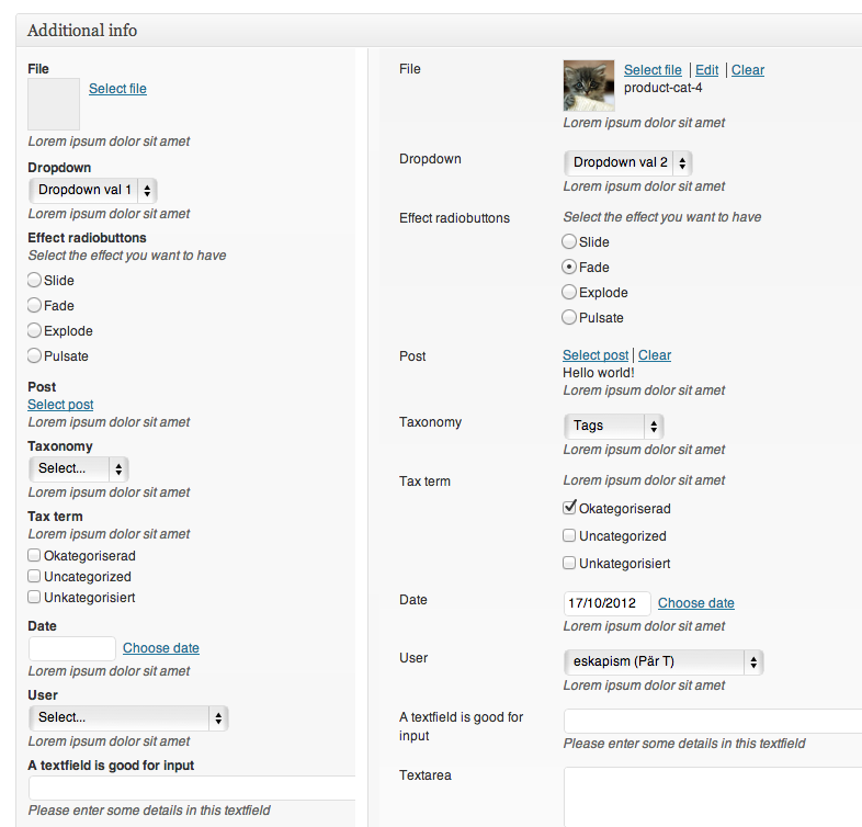
This update features an updated edit post screen, with the label of each field now positioned to the left, makes each field group use up less space and also making the fields more scannable. I’ve tried this for a while myself and I really like it. Please post a comment and let me know what you think of this change!

Editing fields: Before on the left and after this update on the right.
Add link at the bottom of a field group
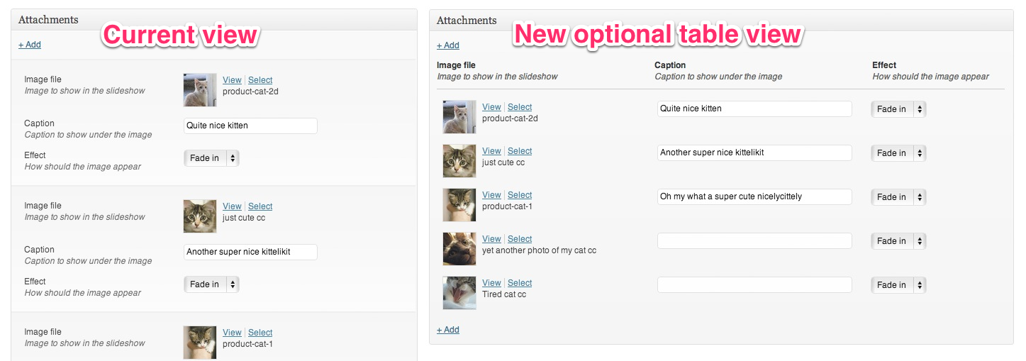
Yes, finally! Long awaited feature: when using repeatable fields, each field group now also has an “add link” at the bottom. Makes much sense when using Simple FIelds and it’s repeatable fields-feature for attachments and image galleries/slideshows. Before this update you could only add new fields to the top, making it really annoying and cumbersome when you wanted to add something to the end/bottom of the list.
Miss a feature in Simple Fields? Let me know about it!
Many of the new features that I add to Simple Fields are features that I’ve received as feature request from you users out there. So if you have a feature request (or a bug report!) please don’t hesitate to let me know by adding an issue over at Simple Fields GitHub page.

